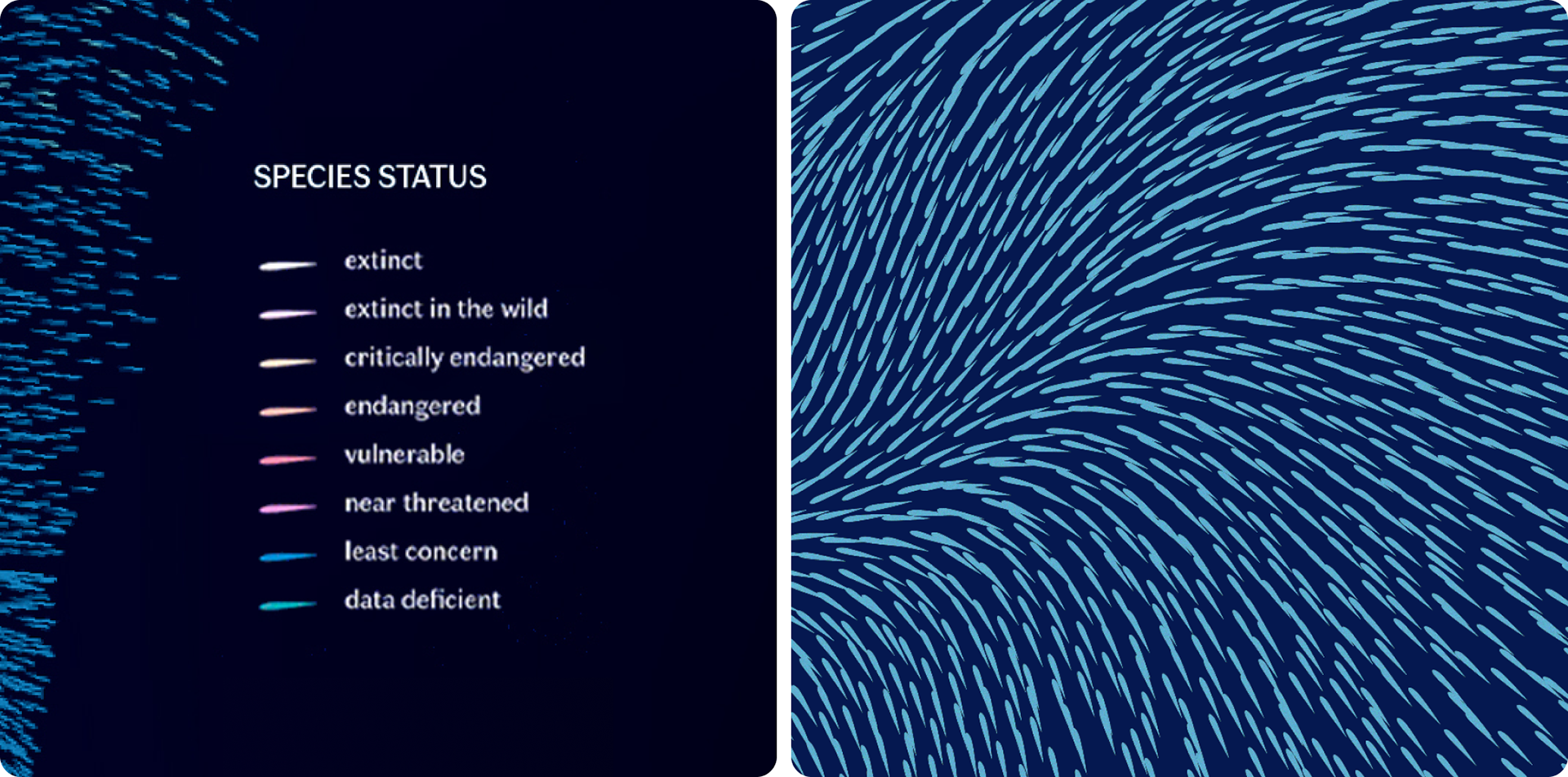
This visualization represents all the described species of birds in the world (11,188 species, based on 2022 data), although this number is likely an underestimate. Each element in the visualization corresponds to a species, with its color reflecting its status on the IUCN Red List: red for extinct or critically endangered, blue for those considered not threatened, and gray for those for which there is data deficiency.
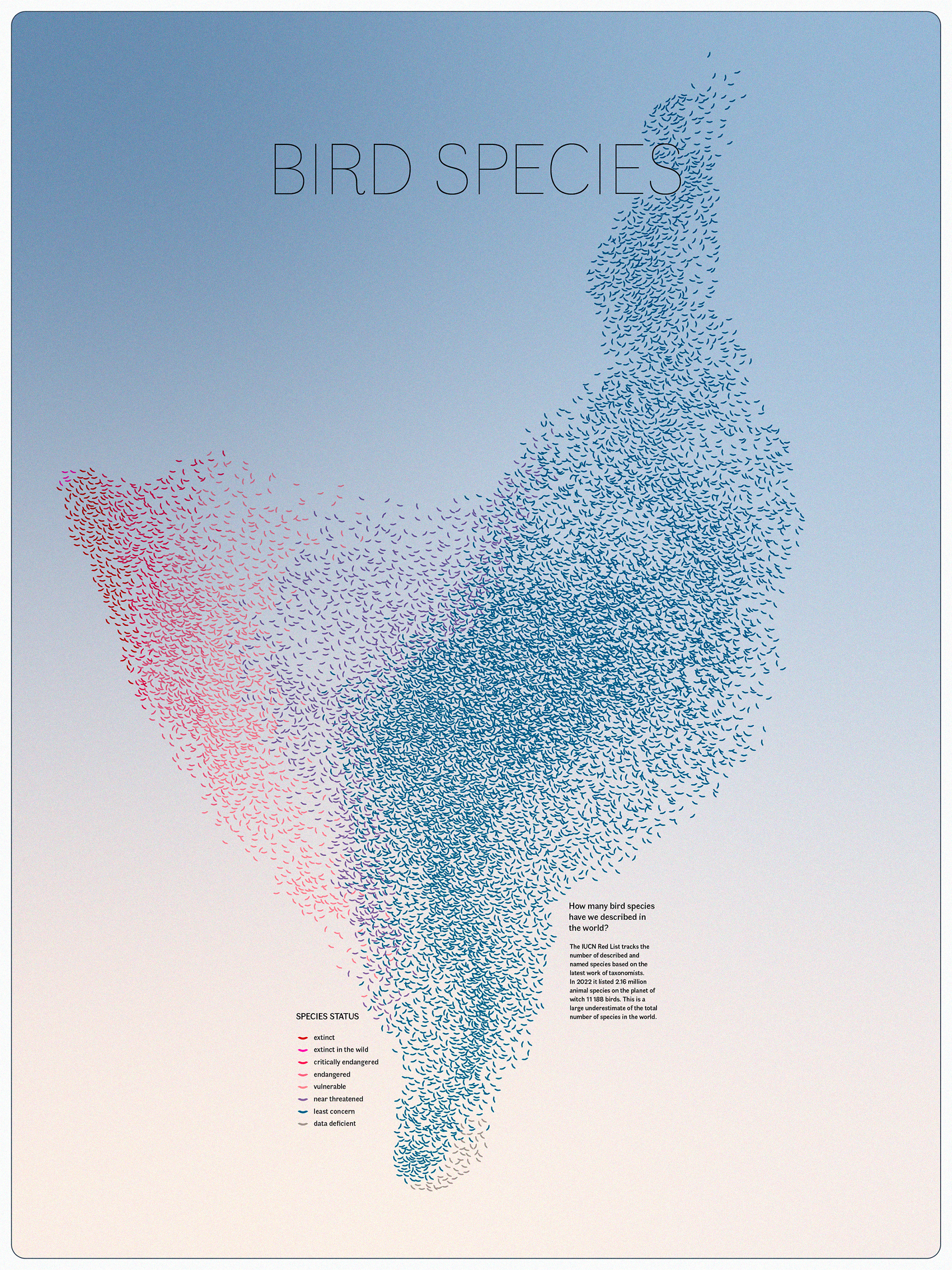
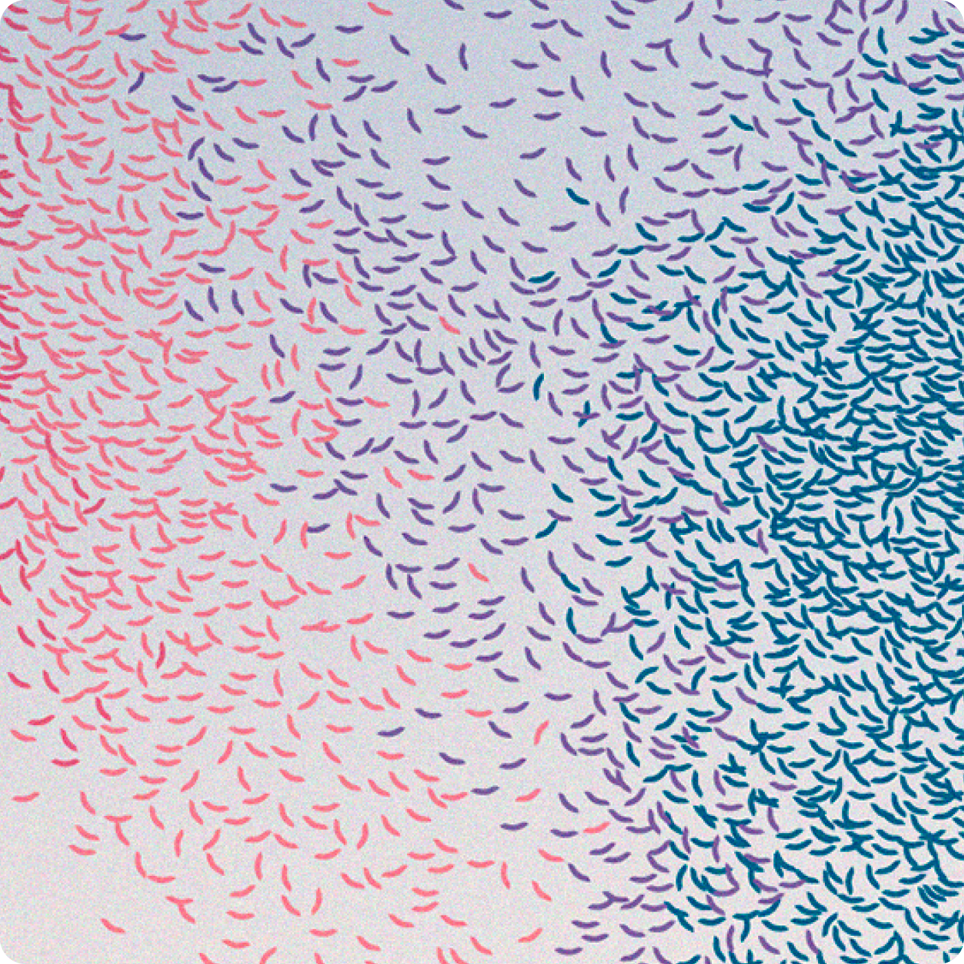
Rather than presenting a precise data graph, the visualization aims to provide a sensitive interpretation of the situation, inspired by the movements of bird colonies observable in the sky. The dynamic arrangement of points follows the fluid, organic patterns of murmurations, where each bird moves collectively while maintaining an individual trajectory. This fluid design highlights both the great diversity of species and the urgency of the ecological threats they face. The layout is not intended for a precise reading of the data, but rather to evoke the collective movement and fragility of bird populations in a visually appealing way.
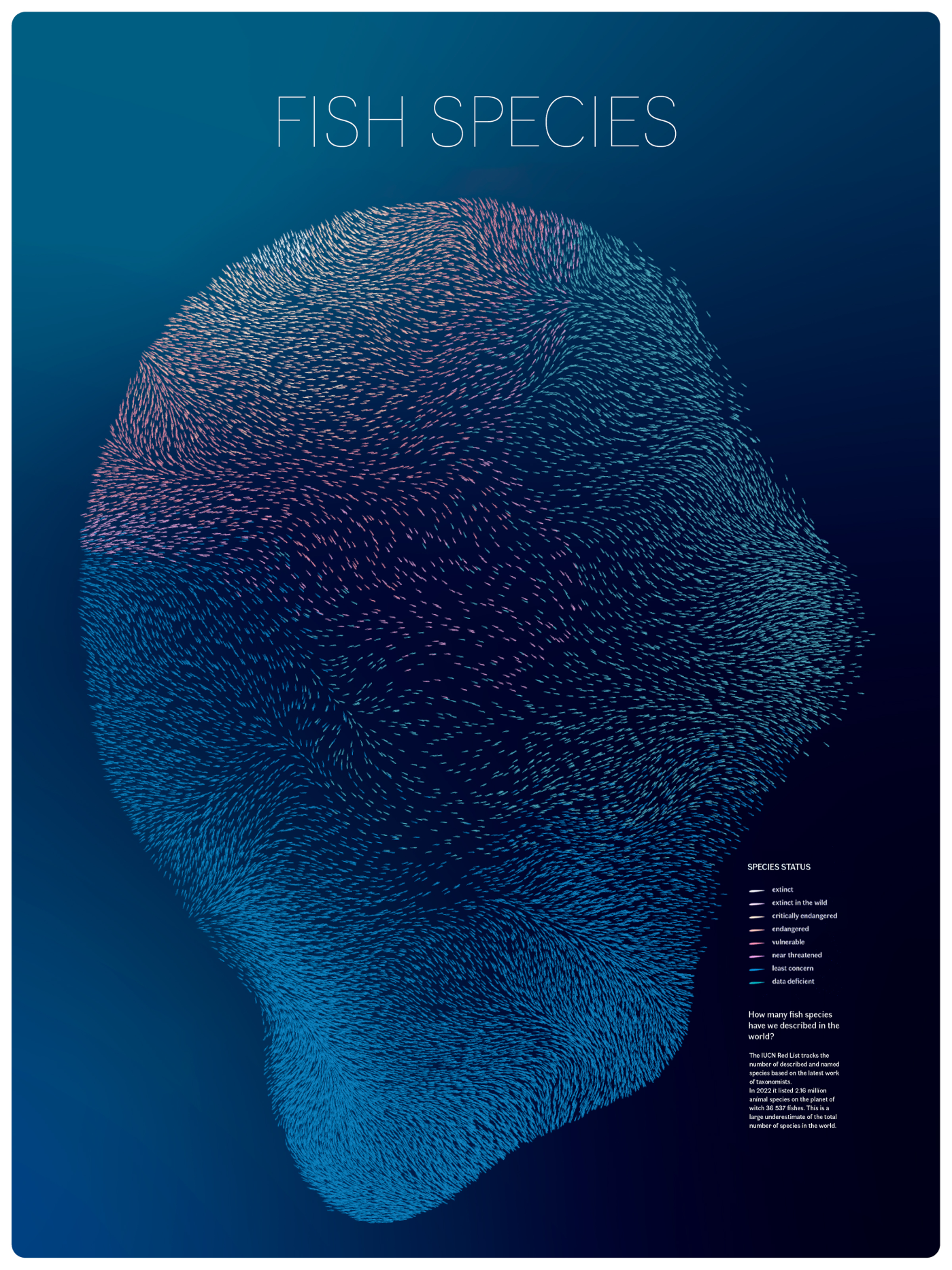
A complementary version of the project applies the same principle to fish species, highlighting the fragile state of the aquatic world. The goal of this visualization is to raise awareness of the magnitude of ecological threats, while celebrating the rich diversity of life and emphasizing the importance of protecting ecosystems.

*Datas from : ourworldindata.org/grapher/number-of-described-species and www.iucnredlist.org Font used : Faune, Alice Savoie / Cnap